Table of Contents
Giving talks
Here are a brief list of rules to follow when designing slides on your talk.
Powerpoint/Keynote
If you don't have a lot of experience, I highly recommend either Powerpoint (Windows/Mac) or Keynote (Mac). Yes, in mathematics, Beamer is an option, but it will close some doors (e.g. animations). You can make anything look beautiful—the question is how much work does it require. Markdown-focused formats (e.g. Quarto) are also possible. But again, Powerpoint/Keynote will be the most flexible initially.
Go to the venue ahead of time
Before your presentation, see if you can visit the venue at a quiet moment. Test your presentation. Test the equipment. Test embedded videos.
Have a backup
Ensure that you have a backup copy of your talk that can be accessed in USB key or internet at a moment's notice. Do not leave things to chance.
Practice the starter and don't be embarrassed
It is very common for beginner presenters to say something like “Oh you might have already seen this before” or “…Well I don't have to do a good job introducing the problem because you've seen this before”, especially when following a similar talk. Don't do that.
Start your talk confidently. Don't be sheepish about it.
This is especially true when presenting in front of peers who you feel know you already.
If you're following a similar talk, you can strengthen yours: “Well last talk, you saw that … but here in this talk, I really want to tell you more about ….”
Title page
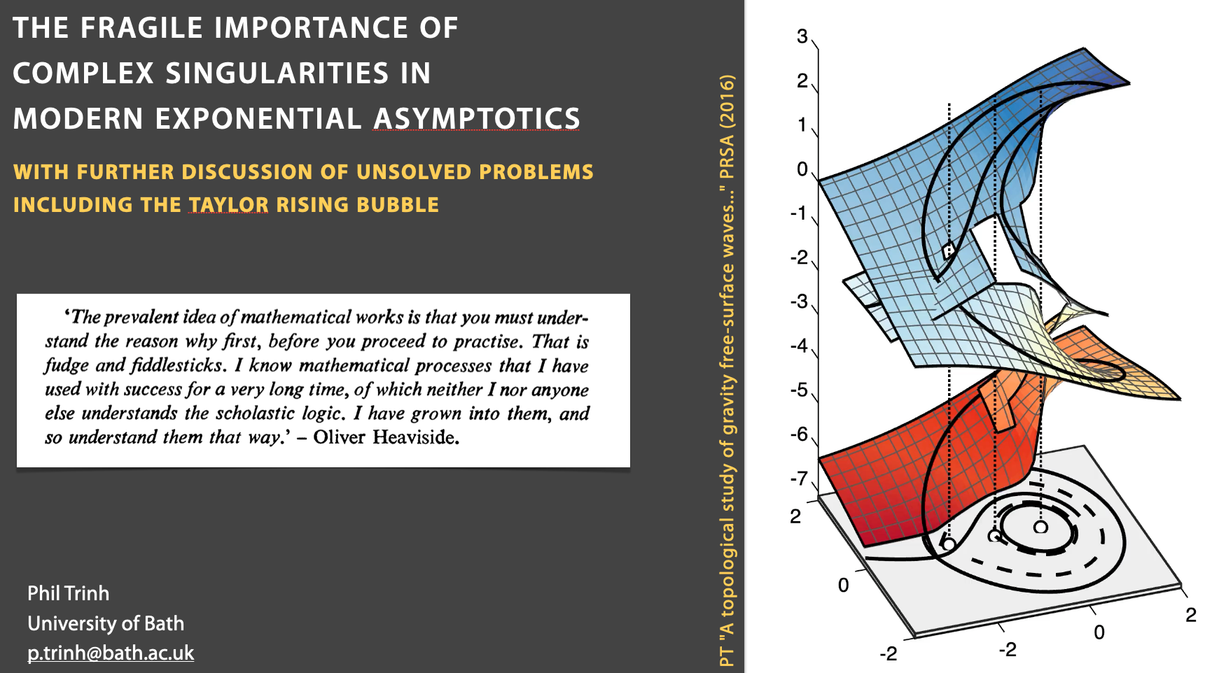
Your title page should include:
- A title
- Your full name (first name as well) and institution (remember the speakers will sometimes not remember your name and need it to introduce you!). So I would use “Phil Trinh” and not “P. Trinh”.
- Your institution
It can also include collaborators (but distinguish this from your name). I like to use an attractive picture as well.
Colour scheme
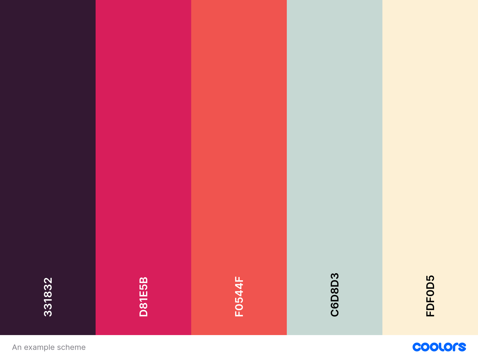
Choose a consistent and sensible colour scheme. Do not use an excessive number of colours. A palette selector can help you.
Layout
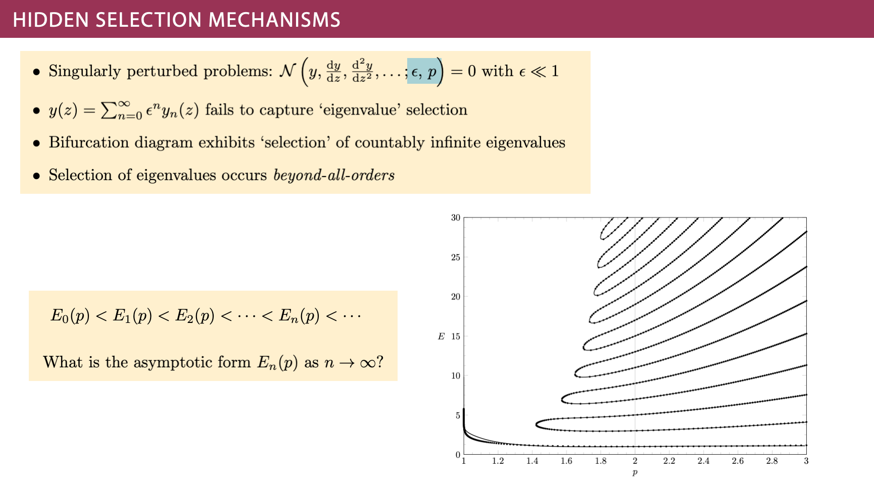
I always tell people to make sure their layout is like a comic strip: we read from left to right, top to bottom (Western). Here is an example of something where it should be easy for the eyes to follow the direction of presentation. I like to put images on the right, typically, or centre aligned.
Equations
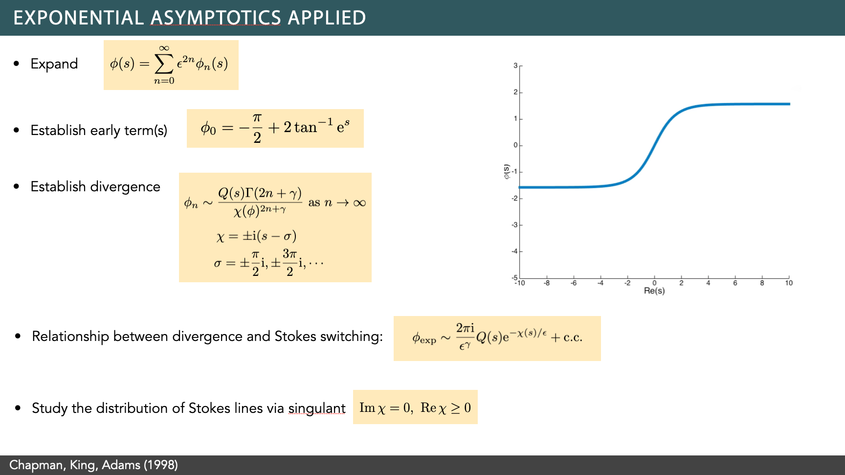
On a Mac, I use LateXIt for equations. I have heard good things about IguanaTeX as well on Windows. I like to use a pale coloured box in the background, which I find helps bring out the equation but does not clutter like an outlined box.
Slide numbers
Use them. The audience may ask you to go back to a certain slide at some point.
Headers
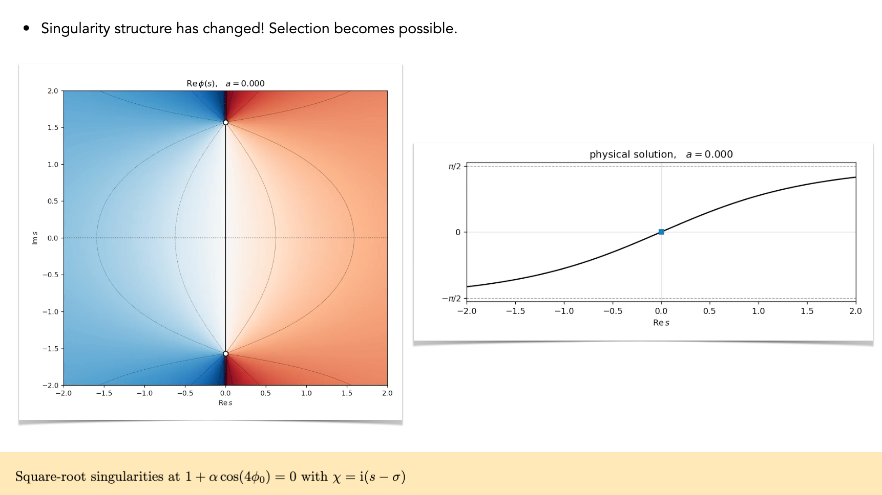
Your headers should be consistently placed and they should not be enormous. You can make the point that in a good talk, they are also unnecessary. Here is an example where I have not used a header. When I do use them, I use a coloured box behind the text.
References
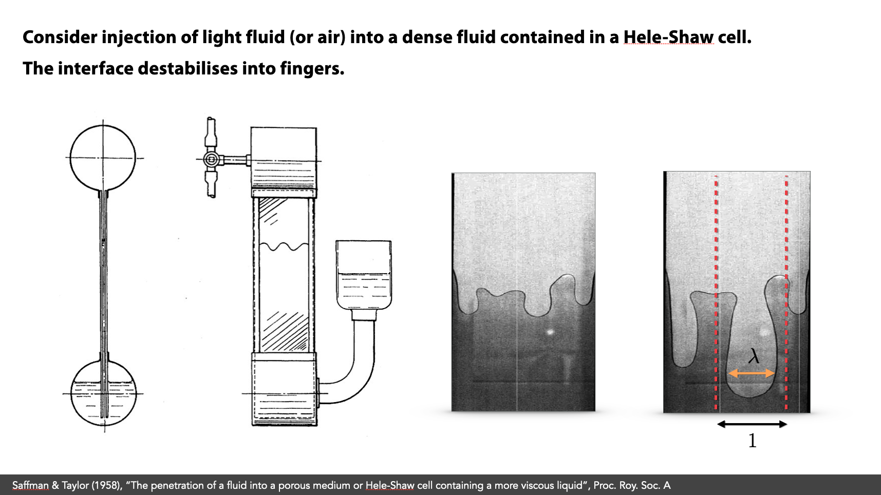
I like to provide references at the bottom. Include authors, years, a few keywords of the title, and the journal.
Information density
I refer to “information density” of a slide. During a presentation, the audience is trying to listen to what you're saying, trying to read equations or text, trying to decipher images. This is all contributing to information density.
Excessive equations, excessive legends, plot styles, colours, bold/emphasis, headers, so on and so forth is contribution to clutter in the audiences' mind. Think carefully about what you want them to see, and remove unnecessary items.
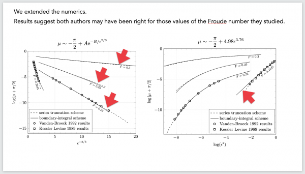
For example, use white boxes to cover up legend or titles from figures. Use the text tool to add in annotations. Here you can see I have used big arrows to point out a feature.
Number of slides
In general, anything approaching 1 minute per slide is extremely fast. The ratio is probably more like 1.3 minutes per slide, so on a 15-minute talk, you want around 12 slides (not including the title).
For a 50-minute talk, you can probably do around 40 slides.
Do a proper ending
Just like the first slide where students are often sheepish to introduce themselves, often people stumble on the last slide. End the talk properly, recapping any important points and lessons.
“Thank you and I would be happy to take any questions” (or similar).
Keep to time
This is the golden rule. Do not go over time. I was once in a talk (50 minutes) where the previous speaker ate into 30 minutes of my time. I decided from the start that I was going to keep to time. So I had to cut my talk down drastically. But the audience appreciated it.
If you have to give a 20 minute talk, and 15 minutes in, you still have 20 slides to cover, take a moment to collect yourself. Adapt to end the talk in 5 minutes by choosing carefully what slide you want to present. Nobody wants you to flip through 20 slides in 5 minutes!